Category
Package Design, Logo Design, Printdesign, Brand Design
The aim of this project was to create a modern and recognizable beer brand for a younger target audience.
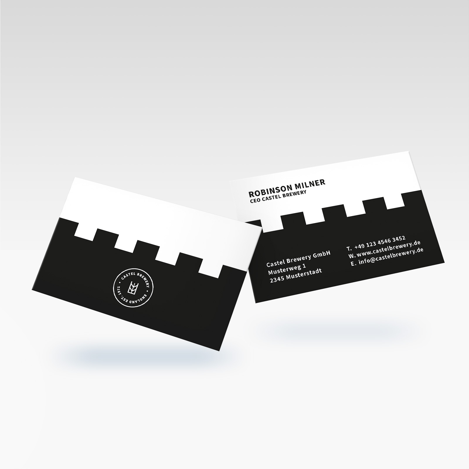
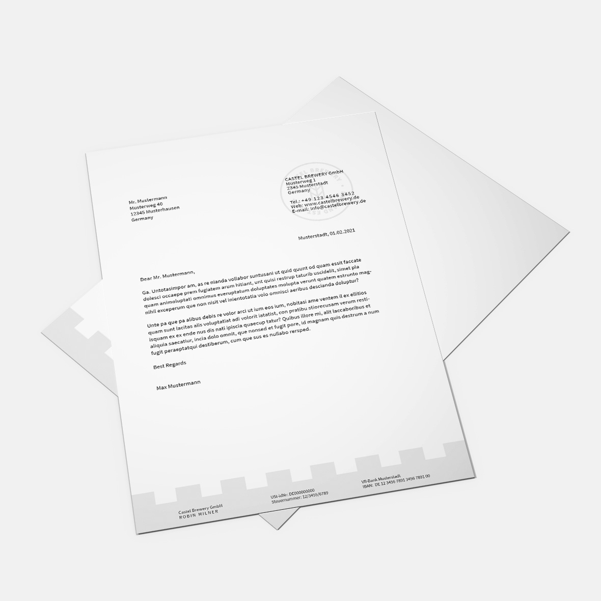
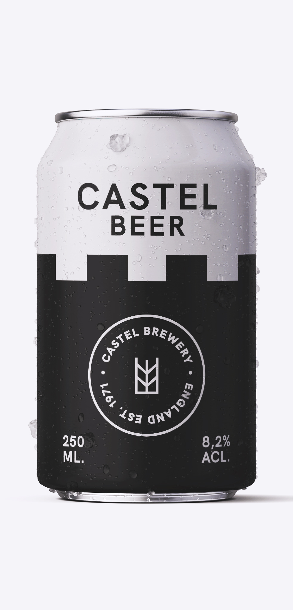
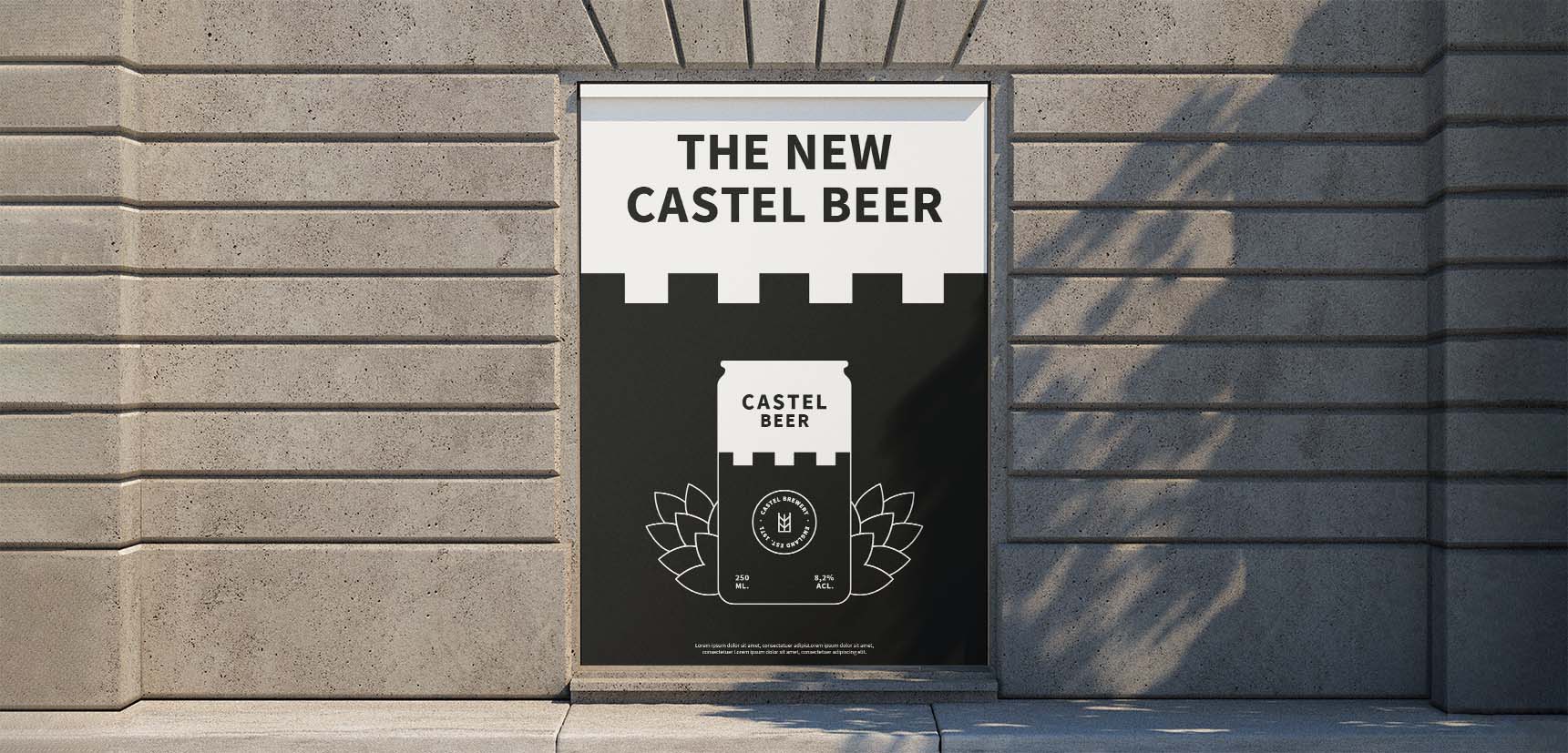
For a brand to be recognizable, everything should mesh together. Therefore, the picture element of the logo is a combination of an ear of wheat (a component of beer) and a crenellated tower. Castel is a modification of the Italian Castello (castle), this is represented by the battlements. The outside text creates a more compact and modern logo that appeals to the target audience. The key element, the black pinnacles, creates a consistent language through all designs, whether business cards, stationery, posters or beer cans. The logo and the recurring key element of the company can be found on the beer can. As a result, the can is recognized and assigned to the Castel Brewery. It is important that stationery is kept simple and clear in order to guarantee a good overview and legibility. For this reason, all design elements are discreetly placed in the background. On the poster, the beer can is placed in the centre, large, and with a hops icon in the background to make it stand out.