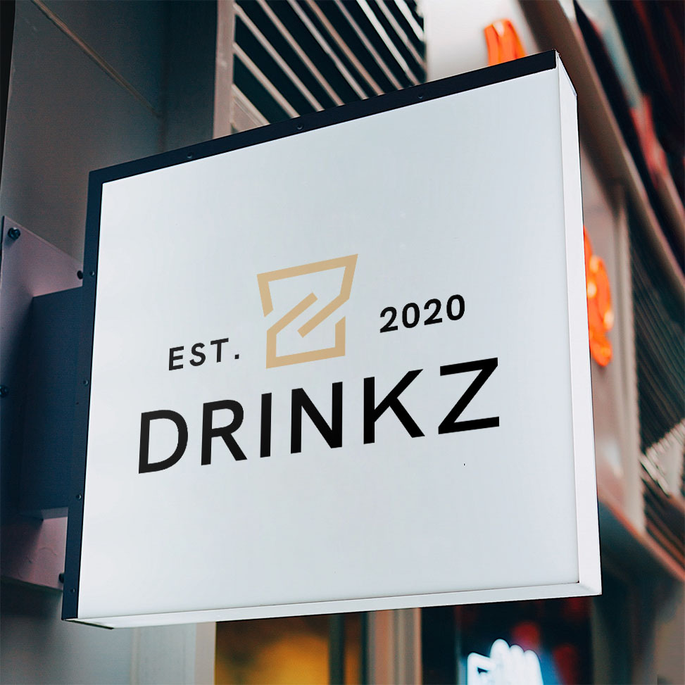
The project aimed to design a modern and suitable logo for the young Drinkz brand, which appeals to a young target audience.
For this reason, the logo used the Z from Drinkz and a shot glass as a reference to the product. The clean lines of the shot glass convey a sense of unity and regularity, while the founding date makes the logo look even more modern and trendy. This appeals to the target audience of the company.